
Thumb-sized buttons.
Big enough to tap, far enough apart to miss the wrong one.
Your customers mostly find you on a phone. I design for that screen first, then make it shine everywhere else.
 I look forward to working with you.
Big enough to tap, far enough apart to miss the wrong one.
One tap to phone you, on every page.
Light pictures and lean code, so it shows before people give up.
Text that fits the screen at a comfortable size.
My own test of 239 local business websites, on Google’s phone test.
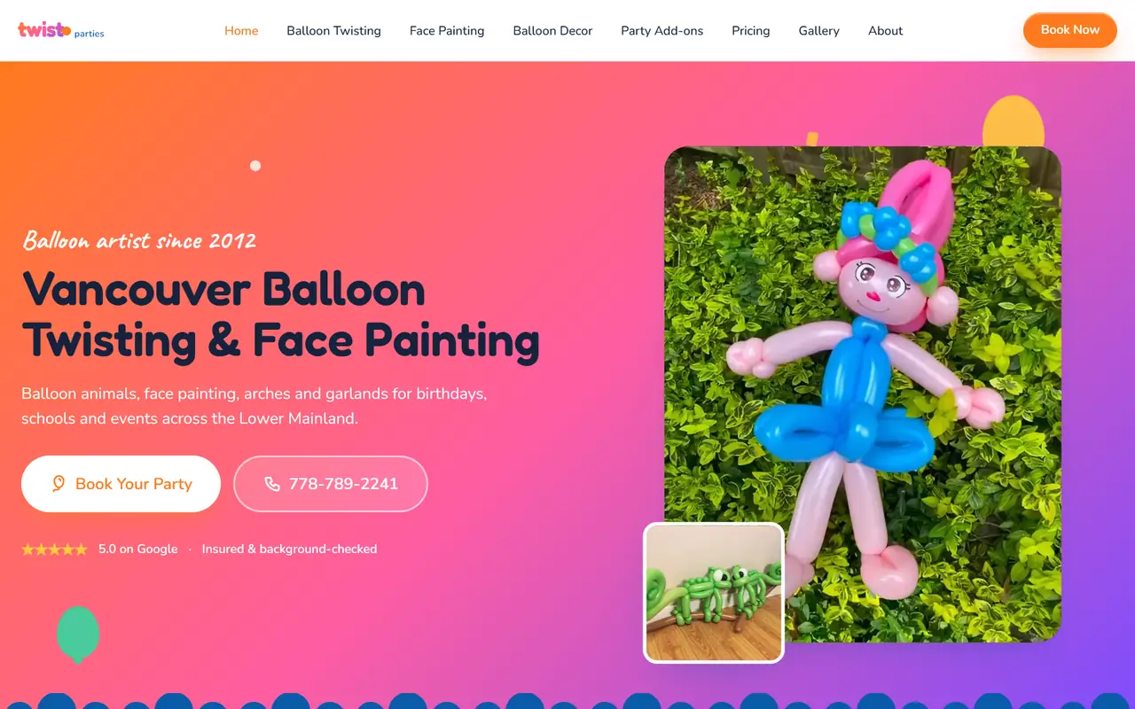
Twist Parties · Vancouver
Her old Wix page was a shrunk-down desktop site. The new one was made for phones first, and her Site Check went from 7.2 to 9.2.
Twist’s siteEvery page starts life on a small screen.
Tablet and computer layouts grow from the phone one.
Google’s phone test, and my own fingers, before launch.
It’s more than a layout that shrinks.
Google now looks at the phone version of every website first when it decides what a page is about and where it ranks. If something only appears on the computer version, as far as Google is concerned it isn’t there. So everything that matters, from your services and prices to your phone number and address, is in the phone layout as real text.
A phone on a busy cell network is the toughest test a website gets. Pictures are sized for phone screens, fonts are trimmed to the letters actually used, and fancy fade-in effects stay off the first screen, because they hold back the main content. When I sped up this website’s own home page in November, Google’s phone score went from the 70s to the mid 90s.
Pop-ups, chat bubbles and big sticky bars hide the very thing people came to see. At launch, Safeguard’s sticky bars covered 28% of a phone screen. That’s how this became one of my rules: one small bar at most, and nothing that pops up the moment someone arrives.
Google’s guidance is tap targets of at least 48 pixels, with space between them, so a thumb hits the right one. Text in forms is at least 16 pixels, because iPhones zoom in on anything smaller and leave people stranded halfway down a form. The phone number is a tap-to-call link on every page.
Layouts break first on the narrowest screens, so every page is checked from small phones up to big monitors. I test with Google’s phone test, with a real browser on a throttled connection the way a first-time visitor loads it, and on my own phone, before anything goes live.
A website that rearranges itself to fit any screen, from a small phone to a big monitor, instead of shrinking the desktop version.
Open it on your phone and try to call yourself, read a page and find your hours. Or run the free Site Check, which tests it on Google’s phone test.
Yes. Google looks at the phone version of your site first when it decides where you rank.
Sometimes a few fixes do it; sometimes a rebuild makes more sense. The Site Check shows which.
Because it isn’t responsive: the phone is showing a shrunk copy of the computer version. A responsive site rearranges itself instead, folding the menu away, stacking columns and resizing pictures to fit.
No. Separate mobile sites were common years ago, but one responsive site that adapts to every screen is simpler to run and is what Google recommends.
I put 239 Coquitlam, Port Coquitlam and Port Moody business websites through Google’s phone test. Only 16 passed. What I found, and what to fix first.
Your free Site Check: 120 checks, in your inbox in minutes.
or
I look forward to talking with you.